E.ON tWEx Gamification event app
Going Hybrid: Real added value through digital infotainment01
Client
E.ON Energie
Event concept & lead agency
circ GmbH & CO.KG
Our task
Concept / UX Design / Development
Every two years, E.ON, one of Europe’s utility providers hosts its leadership conference for executives and talents. For this event, we had the task of creating the digital architecture to engage a diverse group of participants. Through gamificiation this digital playground guided and supported the guests throughout the event and served as a platform for fundamental knowledge transfer. Together with E.ON and circ we created an immersive and collective experience brought to the participants via their smartphones. In combining augmented reality, and artificial intelligence in one seamless digital application, we supported the company’s goals foran intuitive, fun-to-use solution.
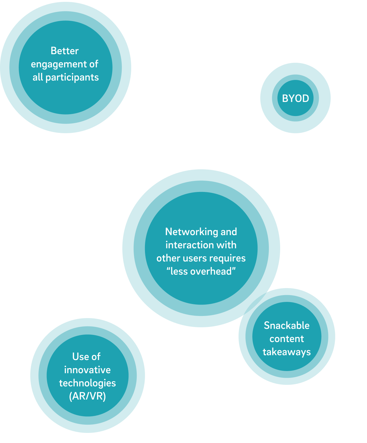
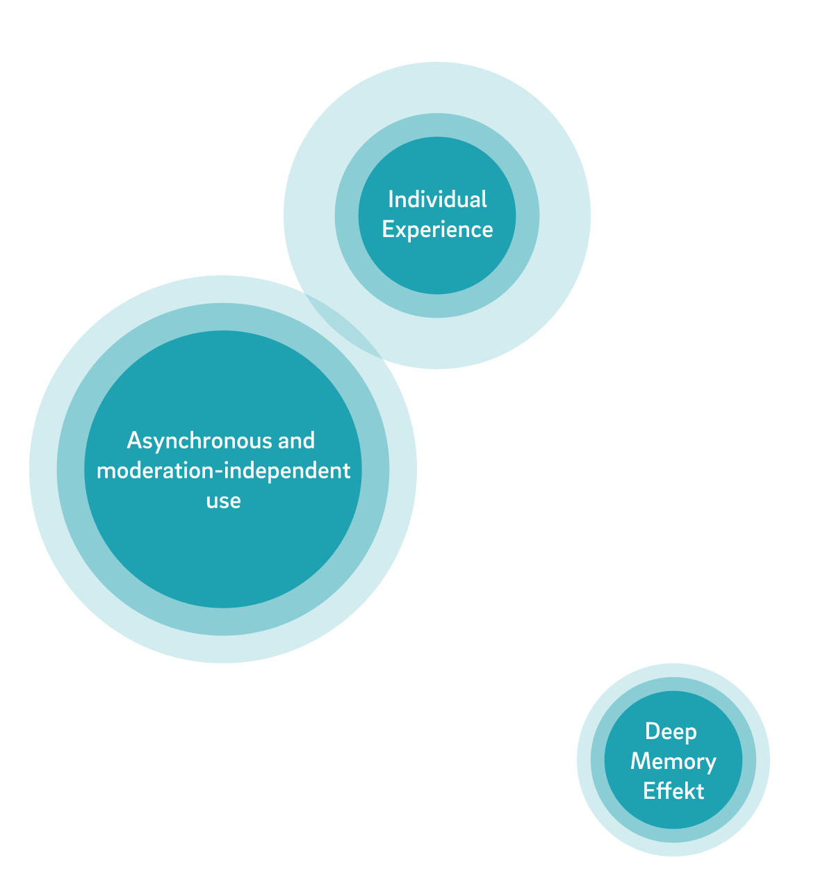
Benefits of integrating digital gamification:
The app concept02
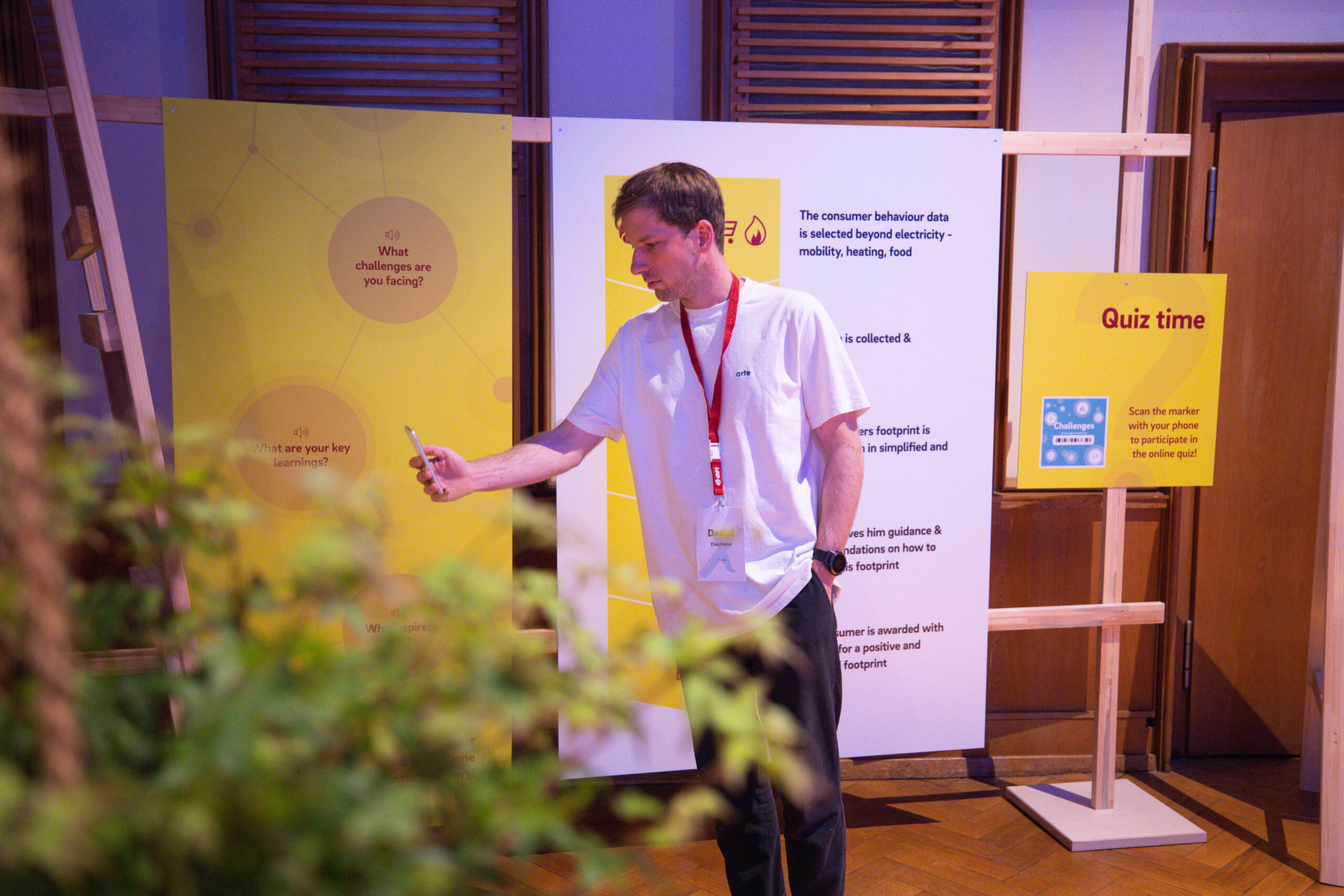
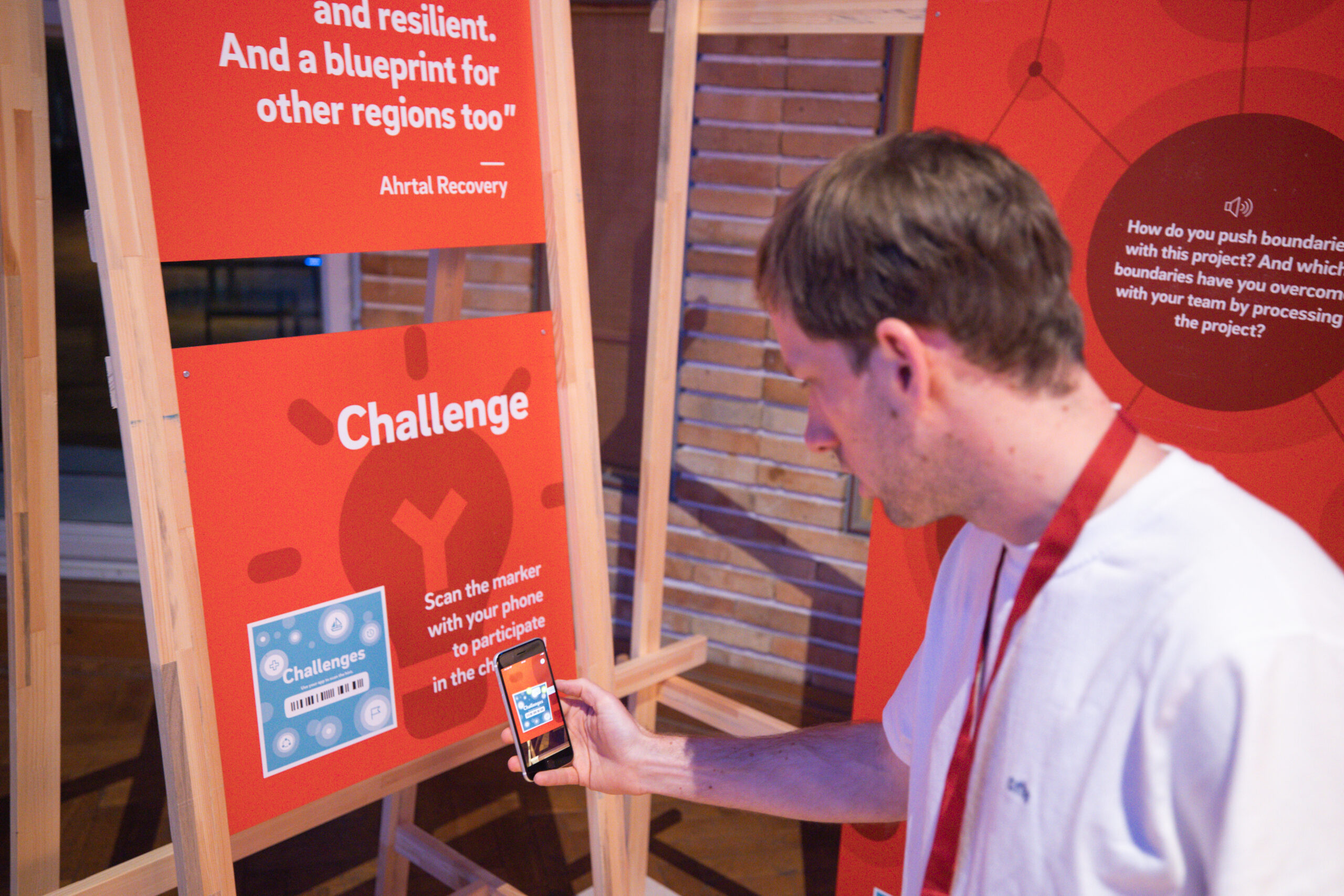
Our app accompanies the 400 participants over the event period of 3 days. Every day, new levels are unlocked, which the users have to complete by working on versatile tasks. The users are guided through the application via push notifications and a digital “host”.
Our requirement for the app development was to create an intuitive and easily accessible app that corresponds to the different digital maturity levels of the user groups. In addition, a modular framework was relevant so that the multitude of content from the different stations could be easily adapted and integrated without appearing redundant. The result was an application that challenged users in a competitive manner, provided them with information in a playful way, and never ceased to amaze them.
With our custom AR gamification app, the boundaries of real event experience and digital implementation merge.03
Highlights
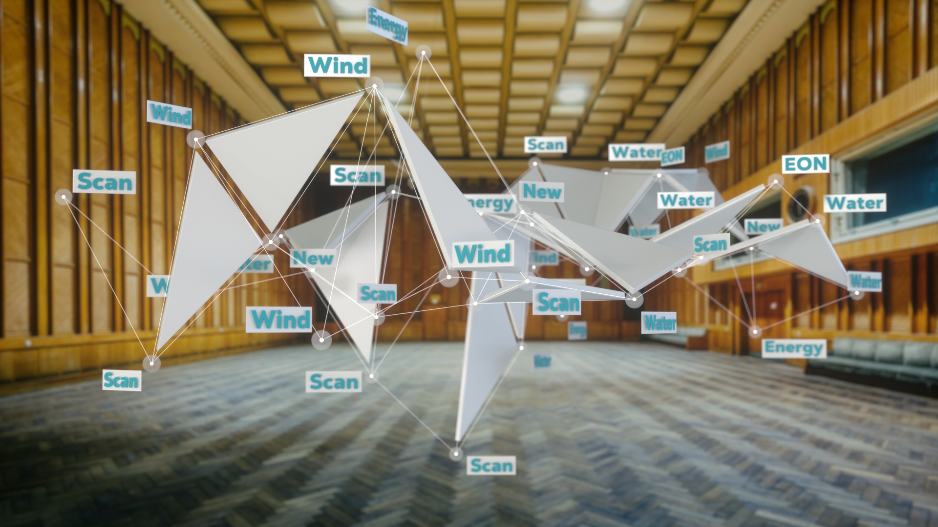
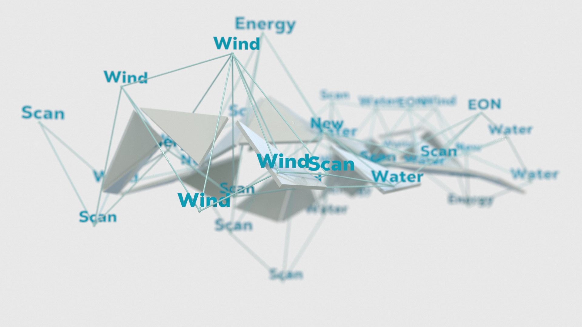
Interactive Word Cloud from User Generated Content04
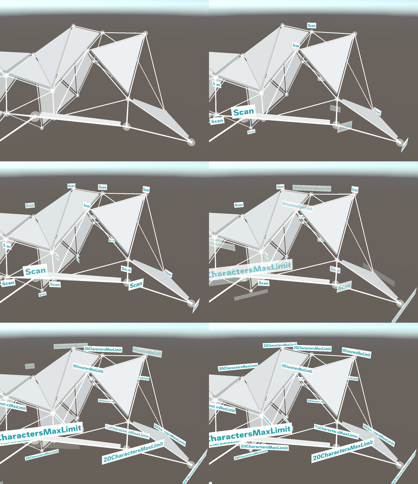
A recurring element in the app was interactive AR “Word Clouds” that stretch above the heads of the participants. Users can enter new ideas via their smartphones, which are then added to the Word Cloud in real time, thus sharing their input with the other participants. Thus, piece by piece, an unfolding collaborative work of art is created.
AR Graphics05
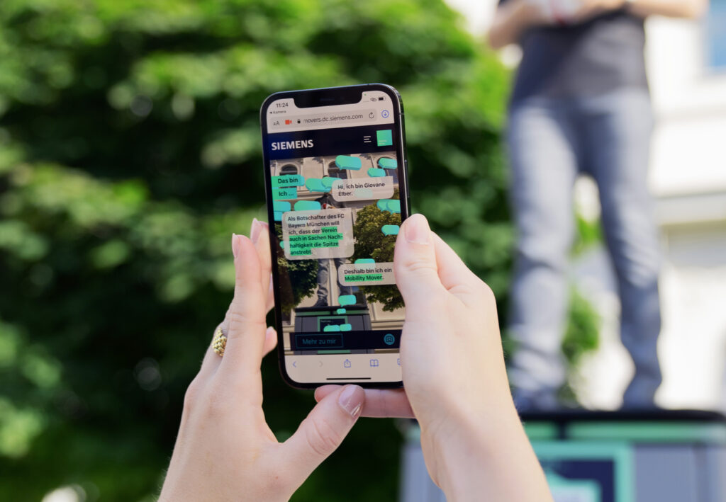
Another challenge was the preparation and distribution of large amounts of information about different projects of the E.ON Group. In order to communicate the complex topics in an exciting and easily digestible way, we again use augmented space to place project-relevant 3D objects that users can explore in a playful way. In other places, videos or explanatory podcast formats are used.
Scoring06
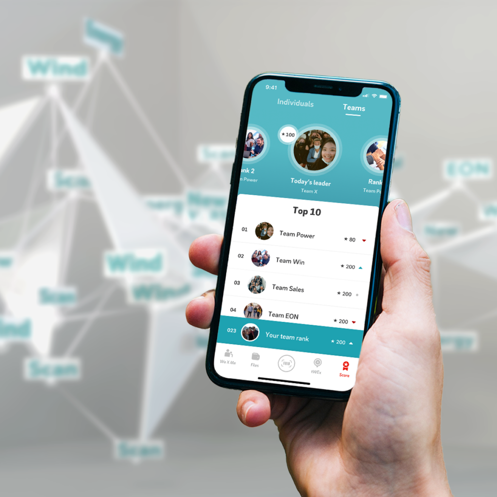
Players move through the event location completing exciting tasks, each of which earns points. The leaderboard shows the scores of the best group and individual performers and thus increases the fighting spirit.
Map07
Digital map: In order to find one’s way around the extensive event site, we developed an info map of the location on which all stations of the game were marked. Each hotspot offered further information on the respective station and conveyed important information on safety instructions, for example.
Digital host08
Using digital moderation, participants were guided through the app and reminded to complete their open tasks when the app was not open.
Thanks to these push notifications and pop-ups within the app, we were able to make sure that all users felt catered to and that even people with less digital affinity could use all the features.
Exciting challenges and a multidimensional journey
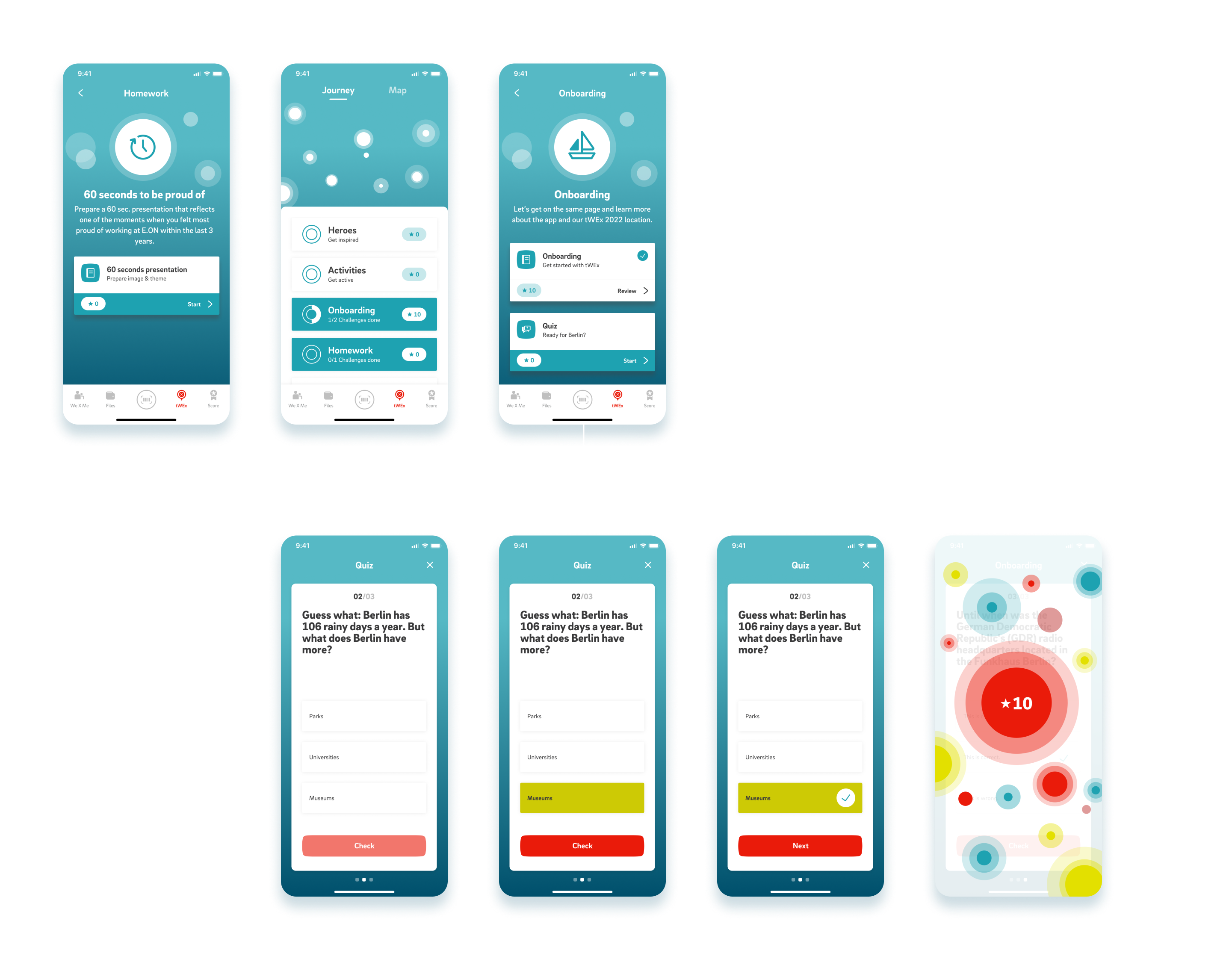

For complex and multi-layered applications like the tWEx app, continuous testing and checking of assumptions in the user journey is indispensable.
Immediately after creating the wireframes, we therefore started the first user testing with two different scenarios to check which flow is more intuitive for the target group. By observing and questioning the test persons, the UX team gets authentic feedback on where adjustments are necessary. With the help of changing test persons from the previously analysed target group, iterative optimisation is carried out until the final style frames can be handed over to development.
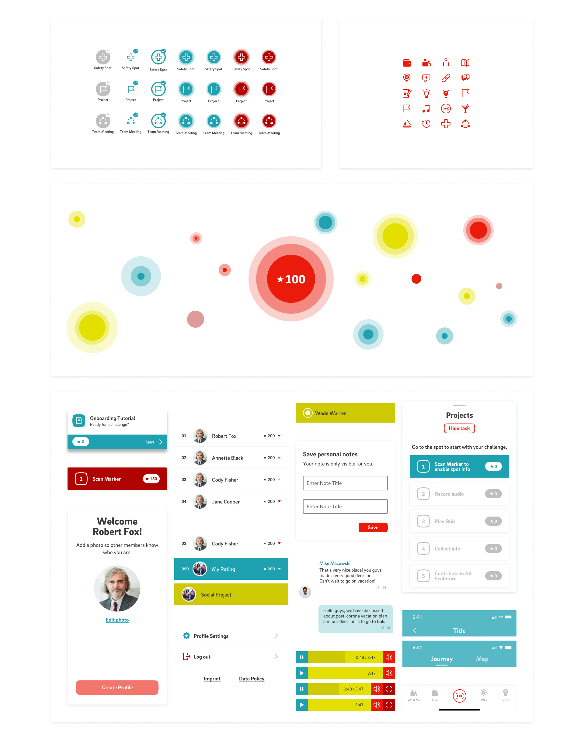

A central challenge during testing with the defined target group was the location of information in the app. Some tasks were linked to the event location or to time sequences, while other information could be accessed at any time. Accordingly, it was important to design a consistent user experience in which learned paths could be repeated and even people with little digital affinity would quickly find their way around.
After evaluating the usability tests, we were able to improve the user flow: Tasks that had a location reference were directly linked to the digital map. More complex tasks, especially in AR / camera mode, were accompanied by the digital host with small assistance. In addition, we use a well-maintained pattern library to ensure that UI elements are used consistently and thus make the user flow more intuitive through recognition.
Days
Users
Markers
Scanned markers
Making-of
